November 03, 2004
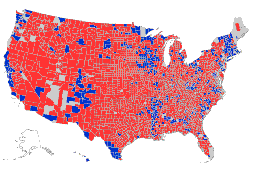
It looks even better when broken out by county
County-by-county results map of yesterday's results:
Fantastic!
Posted by: Fausta at November 3, 2004 08:45 PMWOW! That's a keeper.
Posted by: Sallie at November 3, 2004 10:01 PMYou know, every time I see one of these maps I see just how citified the democrats are.
Posted by: Firethorn at November 3, 2004 10:32 PMI'm in one of those tiny blue zones in the Twin Cities, but I and my roommate still voted for GW.
My hometown of San Diego is nicely red on that map, I think. Not all of CA is moonbats.
Posted by: david at November 4, 2004 03:06 AMThere's a map of 2000 results - it's fascinating to see how much redder is this year.
Posted by: Lola at November 4, 2004 09:17 AMOut of curiosity, what do the grey areas represent? With big ones in Maine and the Miami area, obviously they're not depopulated regions.
Posted by: Scott McClare at November 5, 2004 12:31 PMThis is the Greatest thing that has happen to our country. The Silent Majority Spoke. its all about moral values. The Democracts ship as gone off course.
The American people will not have liberals running our country.
BYE BYE John John
Posted by: Robert Chalmers at November 5, 2004 09:27 PMYeah, it looks great, unless you live in one of those little blue squares. I live in what once was the strongest Republican County in the country, Nassau County, Long Island, New York. I now live under the yoke to 2 Democratic US Senators, a D Congresswoman, a D County Executive & legislator, and as of Tuesday a passel of liberal D judges.
But my President is Red!
Posted by: Tony iovino at November 7, 2004 08:50 AM